2019 • Delivery Hero
Redesigning Checkout Experience
Improving the checkout flow from cart to payment, the redesign facilitated seamless order placement for our users, leading to future growth in conversion rates.
UX Design
UX Research
UI Design
Foodora at Delivery Hero
Company
Delivery Hero is a multinational online food delivery company based in Berlin and operates in 70+ countries with 2000+ talents. Foodora, a part of this network, combines startup DNA and innovation to bring everyday good food to customers.
My contribution
Led the UX design and direction, conducted user research and benchmarking, wireframing, user interface design and and execution.
The challenge
The hurdles in the flow
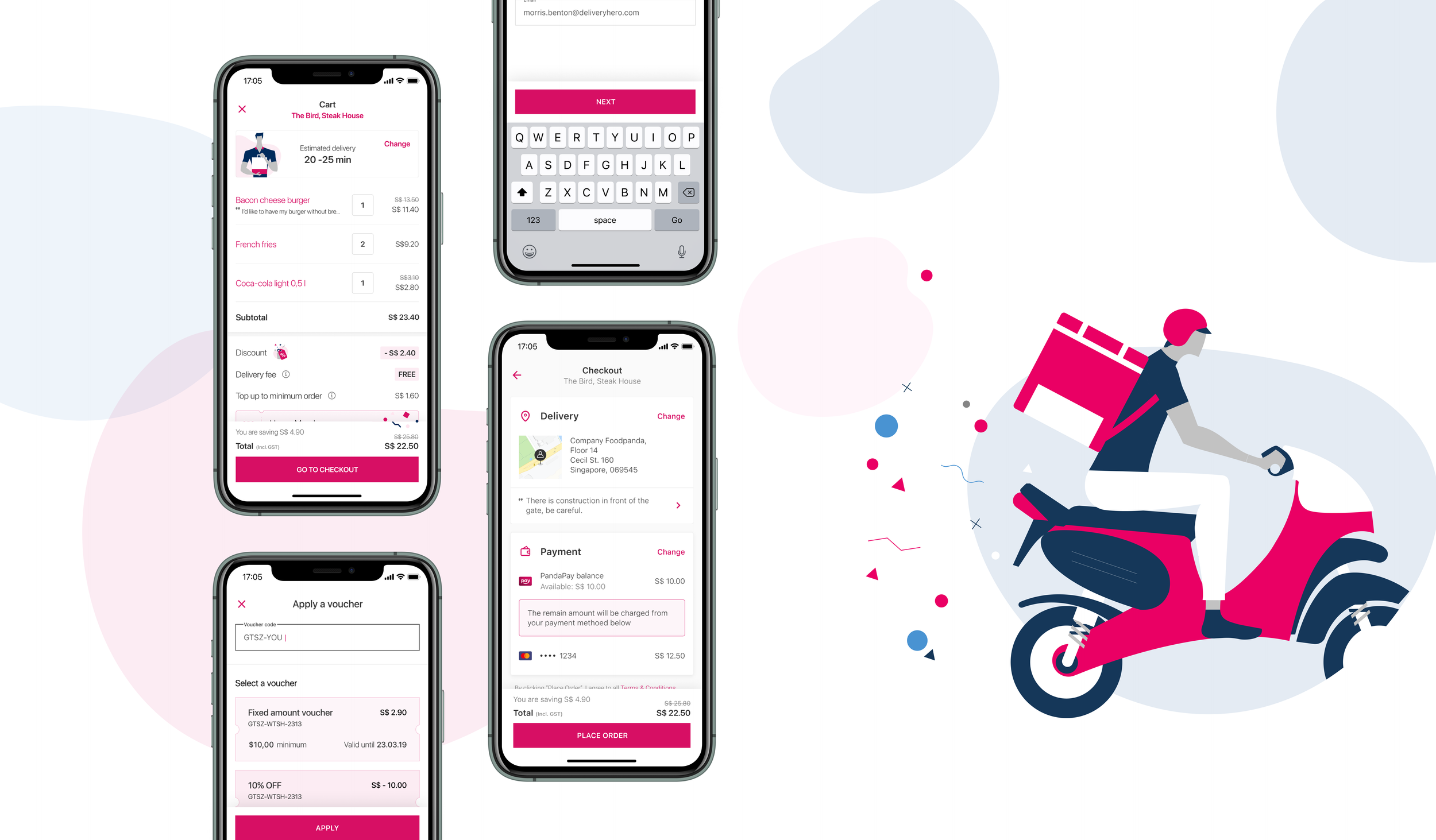
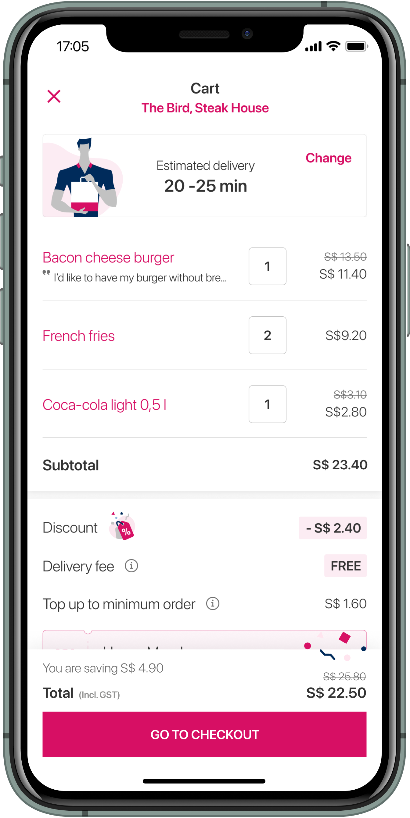
We encountered a very busy checkout screen where both the cart and payment sections were combined, leading to a high cognitive load. The current problems include hidden information, frictional flow, cart and checkout information competing with each other, and a lack of clear calls-to-action, leaving users to figure out what to do on their own. This setup is particularly confusing for new users, as they are presented with various components that do not align with their expectations, hindering their ability to place an order.

Resolving friction by hearing what the market and users say
The approach
These issues had accumulated over time and were identified through various channels, including customer support reports, analytics data, usability testing results, and benchmarking against industry best practices. By gathering insights from these sources, we aimed to gain a comprehensive understanding of the challenges faced by users during the checkout process and identify areas for improvement.

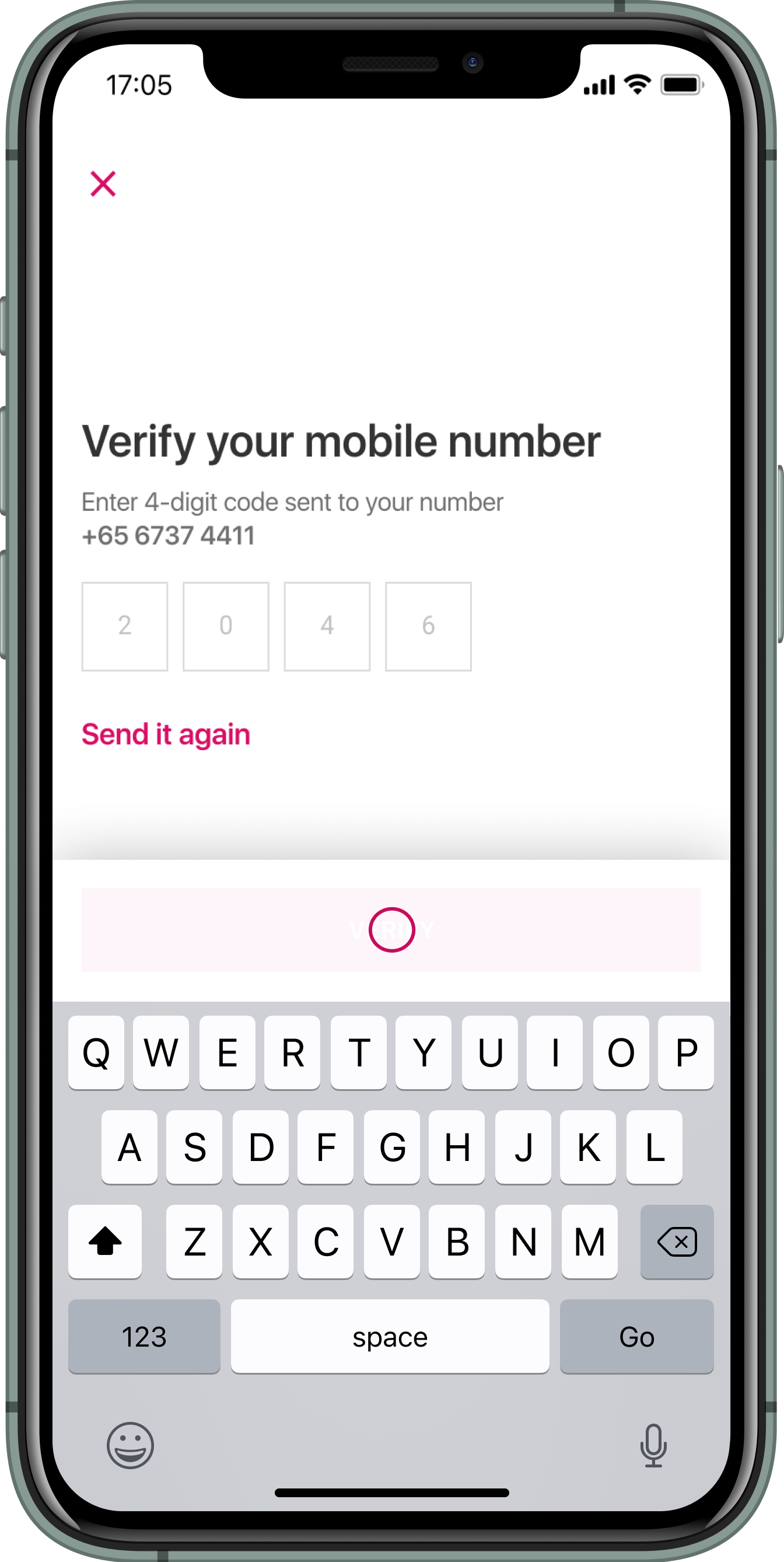
Enhancing user experience: Streamlining checkout with guided flow
The solution
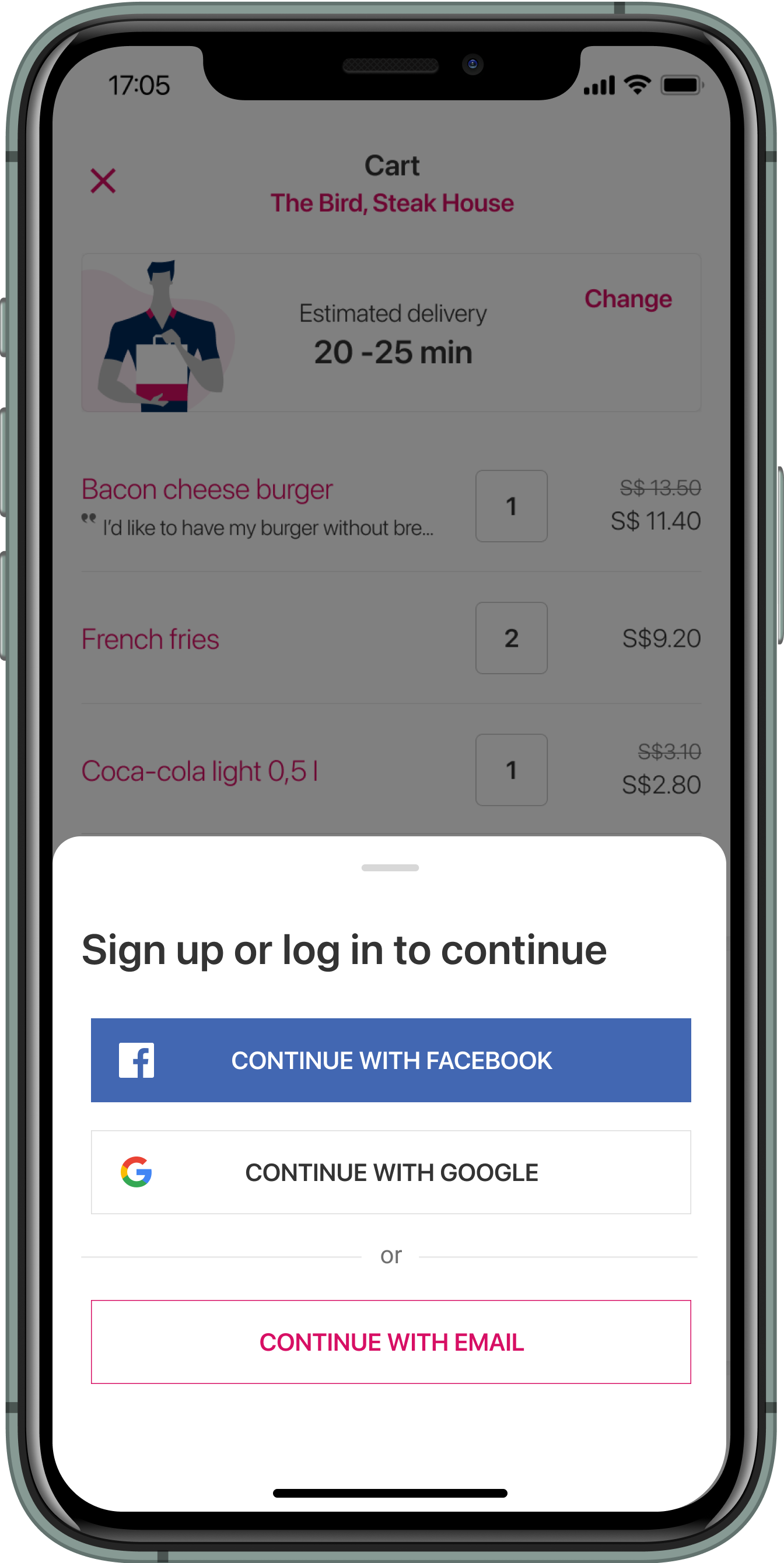
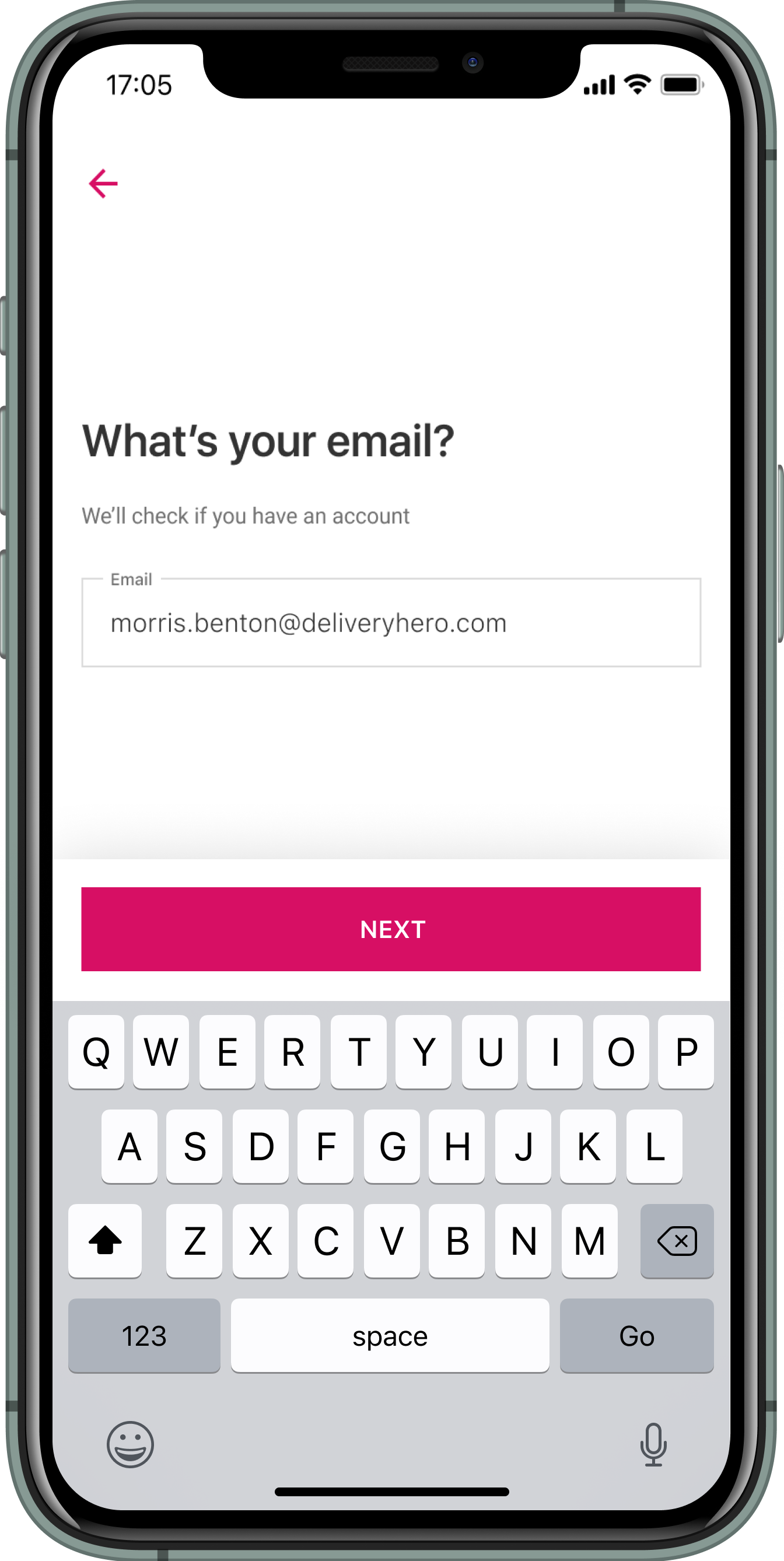
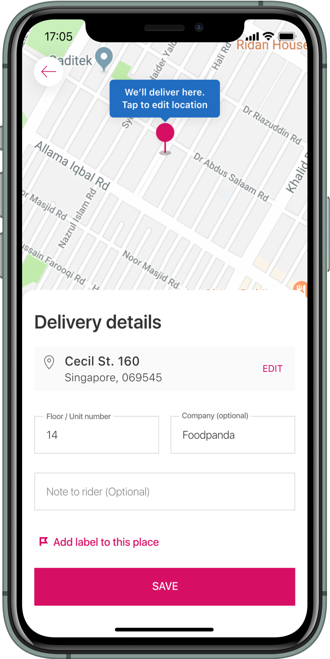
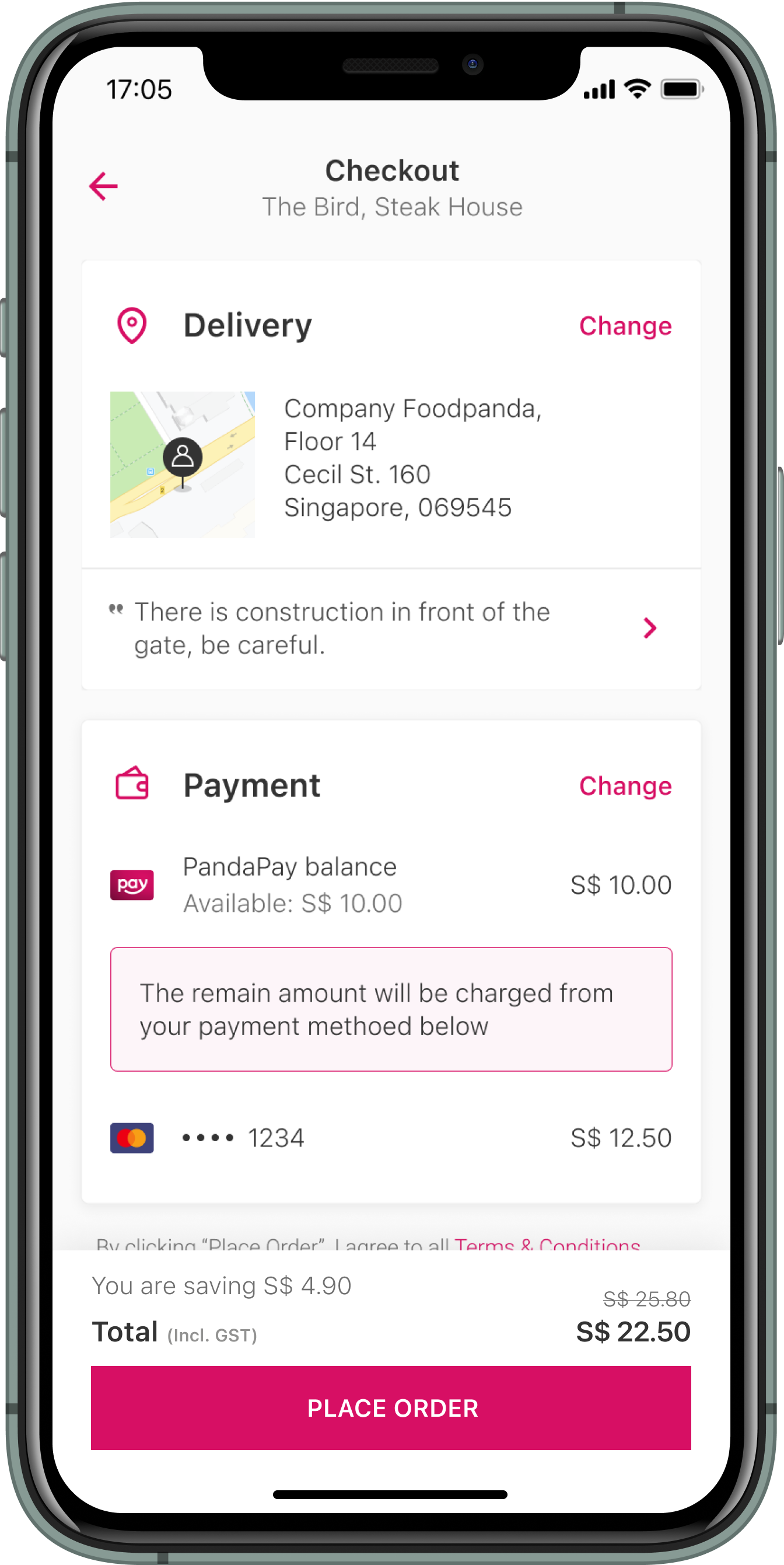
We decided to implement a split cart and checkout screen alongside a guided sign-up flow. Proactive prompts efficiently gather necessary information, while maintaining a singular focus on one task at a time to ensure clarity and minimise distractions.
Segregating tasks into screens ensures users access the each interface for their needs: the Cart for item review and price confirmation, and the Checkout for order confirmation, address, and payment details. We believe this enhances page clarity, reduces cognitive load, and streamlines the user journey toward placing an order.
We decided to separate cart and checkout — To get user focus on the most relevant tasks at each step.


Design and visuals


Future plans
Quality assurance
Ensure that the interface and visual outcomes align with the design.
User testing
Conduct user testing to iterate on the product.
Localisation
As Foodora is a global brand, features should be adapted to different countries as needed.
Thoughts and learnings
This was a large-scale project with many learnings, thoughtful considerations, and decision-making processes. I felt fortunate to lead this project alongside my cross-functional team and design manager. Here are some key takeaways:
Listen to the user and keep iterating the product
Since joining the team, we have consistently conducted user research and gathered insights. Maintaining a documented record of user feedback has significantly aided in designing a better product for them. Throughout the project, I conducted several rounds of user testing and continuously listened to their needs, which greatly contributed to improving the checkout experience.
Collaboration is the key
This project was both enjoyable and challenging, requiring extensive discussions and alignments between teams and across countries. Managing design, stakeholder expectations, and tight timelines proved crucial. Ensuring everyone is on the same page undoubtedly encouraged collaboration.
Being bold in decision-making
With numerous parties involved, there were inevitable discussions and conflicts due to differing perceptions. As the project lead, I learned the importance of being bold in decision-making at the right time to push the process forward.