2018 • Foodora and Foodpanda at Delivery Hero
Building a Brand-agnostic Design System
Foodora’s design system allowed the team to scale up faster and streamline design and development. By creating rules and reusable components, we are able to design with consistency, apply changes faster, and onboard new brands to the platform.
Design System
UX Design
UI Design
Delivery Hero, a brand-agnostic platform
The brand
Delivery Hero, a leading multinational online food delivery service operates in over 50 countries across Europe, Asia, Latin America, and the Middle East. The company manages a diverse portfolio of brands, including Foodora, Foodpanda, and Onlinepizza etc, each tailored to meet the unique demands of their respective markets.
It has also started quick commerce to deliver small orders fast. This expansion shows the need for scalability and adaptability across different markets and brands to maintain efficiency and meet customer expectations.
My contribution
I took the initiative and played an active role in building a global, brand-agnostic design system for the Foodora and Foodpanda platforms. This system accommodated the needs of a scaling product in 21 countries around the world, laying the foundations for a platform-independent solution that supports diverse market demands.
The challenge
Challenges of rapid growth
As Foodora and Foodpanda have experienced rapid growth over the past three years, many product features were quickly refined and developed using instance design components to meet tight deadlines. However, the absence of a centralised resource of components and guidelines made daily tasks challenging for both designers and developers. This often led to extensive hand-off discussions and alignments, resulting in a product that lacked consistency and scalability. This issue is often evident in products undergoing hypergrowth, where many inconsistencies in the user experience and UI can typically be observed.
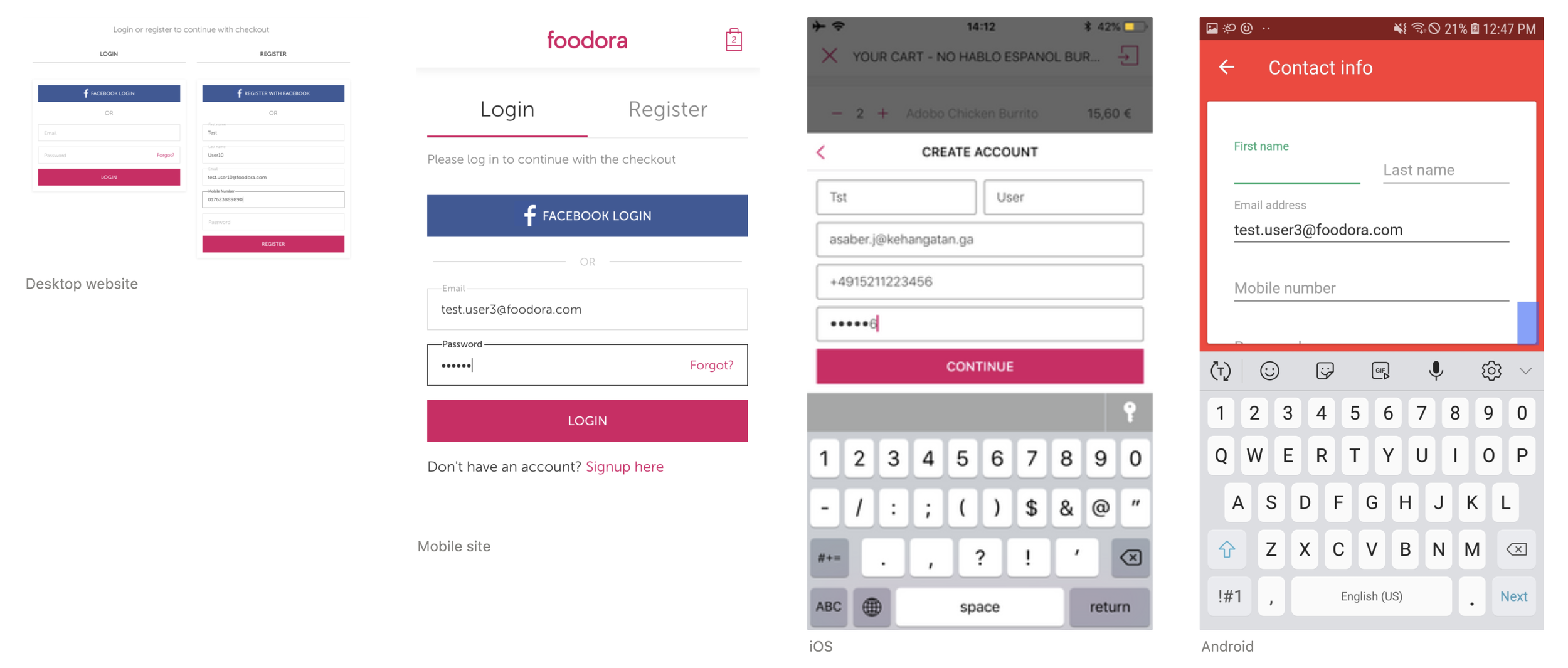
A screenshot comparison of the input fields component across desktop website, mobile site, iOS, and Android platforms, highlighting inconsistencies in design and layout.
Strategic offsite: Get together the team
The approach
The entire design team went on a week-long offsite dedicated to stepping back, mapping the existing product entirely, defined our design system principles, and then coming up with a simple redefinition of its components.
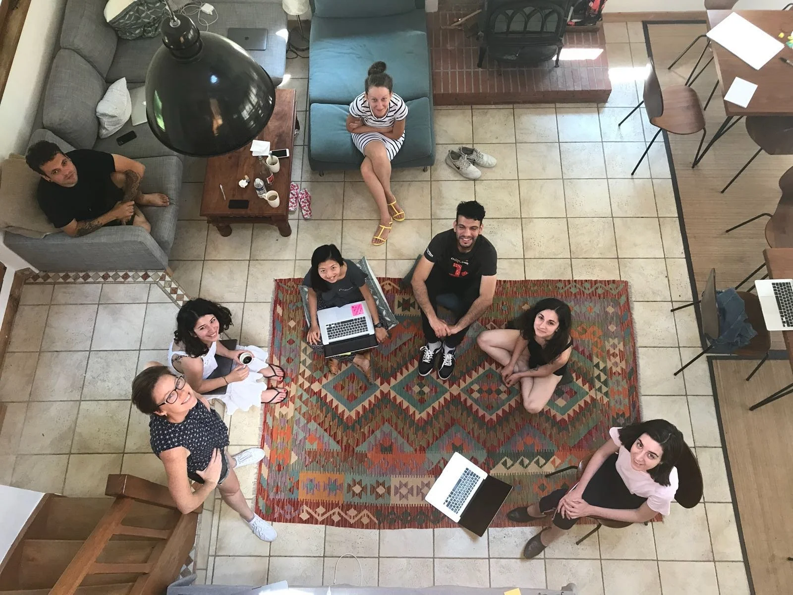
Team photo at the offsite in Toulouse, focusing on the building a Design System.
Definition of Design System
Our team of eight designers travelled in Toulouse with a picturesque view to define the values of our design system. We aimed to create a system that is both visually appealing and highly functional, ensuring that every design decision enhances user experience and meets user needs.
Comprehensive audit and understanding the status quo
I took responsibility for the input fields, critical components in the checkout and payment processes. By examining our existing implementations across web and mobile platforms, I gathered screenshots to audit current usage, analysed scenarios, and noted inconsistencies, which required a lot of strategic thinking to come up with a one-catch-all solution that is also flexible.

A detailed table showing an audit and inventory of input fields used in homepage, login and registration, checkout across platforms.
Building a scalable and efficient design library for future growth
In the development of our component library, I refined the definitions and usage details for each type of input field. These elements were systematically organised into our sketch library, where I focused on their structure and created comprehensive style guides for each state.
We made sure the libraries were meticulously organised and named to facilitate easy access, reuse, and future expansion. This structured approach not only enhances the efficiency and consistency of our design process but also supports the scalability of the Foodora design system as the company grows and adapts to new needs.

Creating symbols in Sketch library.
The Cookbook — our design system recipes
We started meticulously document our design guidelines, which include usage, specifications, states, behaviours, dos and don'ts, and different use cases, compiling them into what we refer to as our "Cookbook." This documentation serves as a daily reference for both designers and developers, ensuring consistent implementation across teams.
The handoff process to developers is streamlined through the export of both components and their associated documentation to Zeplin, facilitating integration by different squads within the company.
Maintaining and regularly updating this library is crucial. We are committed to a design system that is easily accessible and useful to all levels of designers and developers, supporting them with updated resources and thorough documentation.
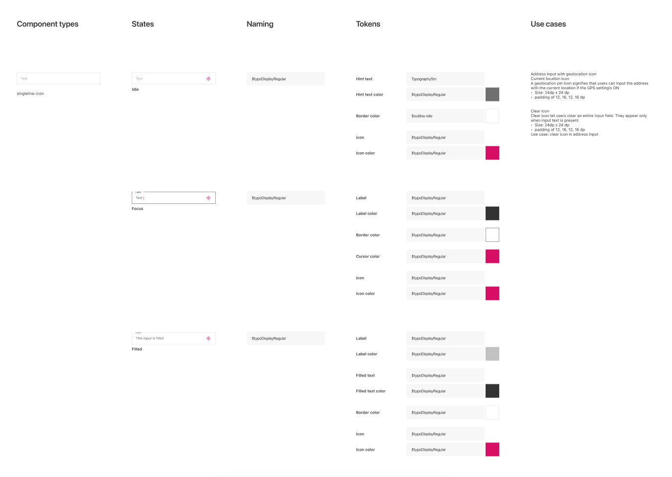
Sneak peek of input fields documentation showcasing states, naming, tokens and their use cases.
Thoughts and learnings
Starting the initiative
Educating and promoting the design system within the company. Initially, the concept of a "Design System" was relatively new in the industry, and not many within the company understood why it was necessary. We made it a priority to include this initiative in our quarterly OKRs, dedicating ourselves to its implementation. Through continuous educating, alignment meetings, discussions, and detailed explanations across different departments, we eventually helped everyone grasp the importance of this project, leading to effective collaboration in its implementation.
Teamwork is essential
As the design team expanded from three to eight members, although none of us were experts in Design Systems at the outset, we organised an offsite in Toulouse, France, to dedicate our focus. This was not just a working trip but a chance to redefine our principles, missions, and goals. The week spent in Toulouse was not only productive but also fun, strengthening our team dynamic and determination to succeed.
Continuous learning and knowledge sharing
It’s crucial to always keep in mind the primary goals of the Design System: to enhance efficiency and ensure consistency across the product. Developing a design system from scratch is challenging and sometimes exhausting, particularly when integrating it with existing implementations. Some tasks were monotonous, but I motivated myself by remembering that a robust design system benefits the team, the business, and the end-users alike. This motivation drove me forward, and I firmly believe the results were well worth the effort.
Team
Skali Skalska — Head of Product Design, Consumer Tribe
Leo Fernandes — Product Design Manager, Consumer Tribe
Anna Herasymenko — Product Designer, Location
Ashley Wade — Product Designer, Growth
Lucia Tahan — Product Designer, Post-odering
Ahmed Mohaisen — UI Engineer