2022 • Mobimeo
Setting Up “Up-next” Alarm
By showing the “Up-next alarm” on the home screen, users will know and prepare their commute routes better.
UX Design
UX Research

The app — Streckenagent
Deutsche Bahn is one of the world’s leading mobility companies, with connections to 150 cities in Europe, serving over 40,000 passengers commuting daily.
Streckenagent is a mobility app that provides everyday mobility solution tailored to users with convenient and efficient ways to navigate cities, not only using public transportation but also new mobility players such as TIER and Voi.
The challenge
The two types of route subscriptions (repeating alarm and fixed-schedule alarm) are not obvious enough to show users the next commute. This leads to miscommunication with users and messes up their routes.
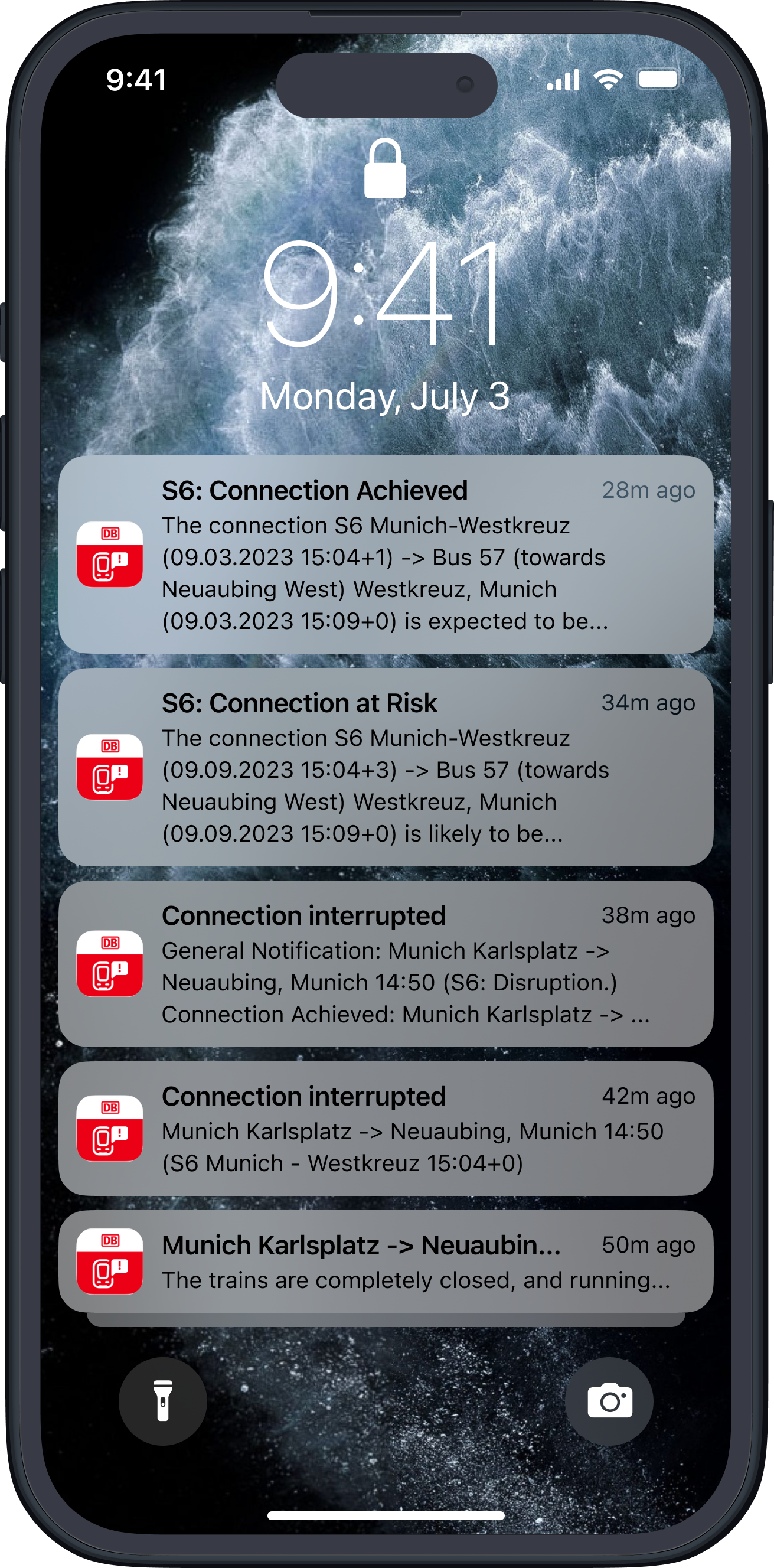
Lock screen with a stack of push notifications from the Streckenagent app.
My contribution
I was part of a cross-functional team with a Product Owner as well as Engineers (iOS, Android, Backend and QA). I crafted the solution for the route subscription topic.
Route subscription alarm — a commute reminder
The context
Route subscription alarms enable users to set up push notifications for a specific public transportation trip. If there is any disruption or update about the trip, the user will get a push notification, so they don't need to keep checking their phone for updates.
This feature is useful for regular routes, making it perfect for commuters who take the same trip on a set schedule and want to stay informed about any possible delays.
We also offer a fixed-schedule subscription alarm, meaning the user will receive push notifications for just one specific trip.
No visibility on the route subscriptions
The problem
The feature was designed for a "universal commuter," but research showed that commuters in Germany have very different experiences because public transport varies so much. We needed to consider these differences and find a solution for each commuter type. Also, the original setup had two types of alarms that were hard to explain, and most users didn't understand them. Users couldn't clearly see the connections they subscribed to or view their upcoming connections from their alarm subscriptions, which led to frustration from receiving what they felt were spammy and irrelevant notifications. This issue, along with too many push notifications due to a lack of customisation options, resulted in high operating costs.
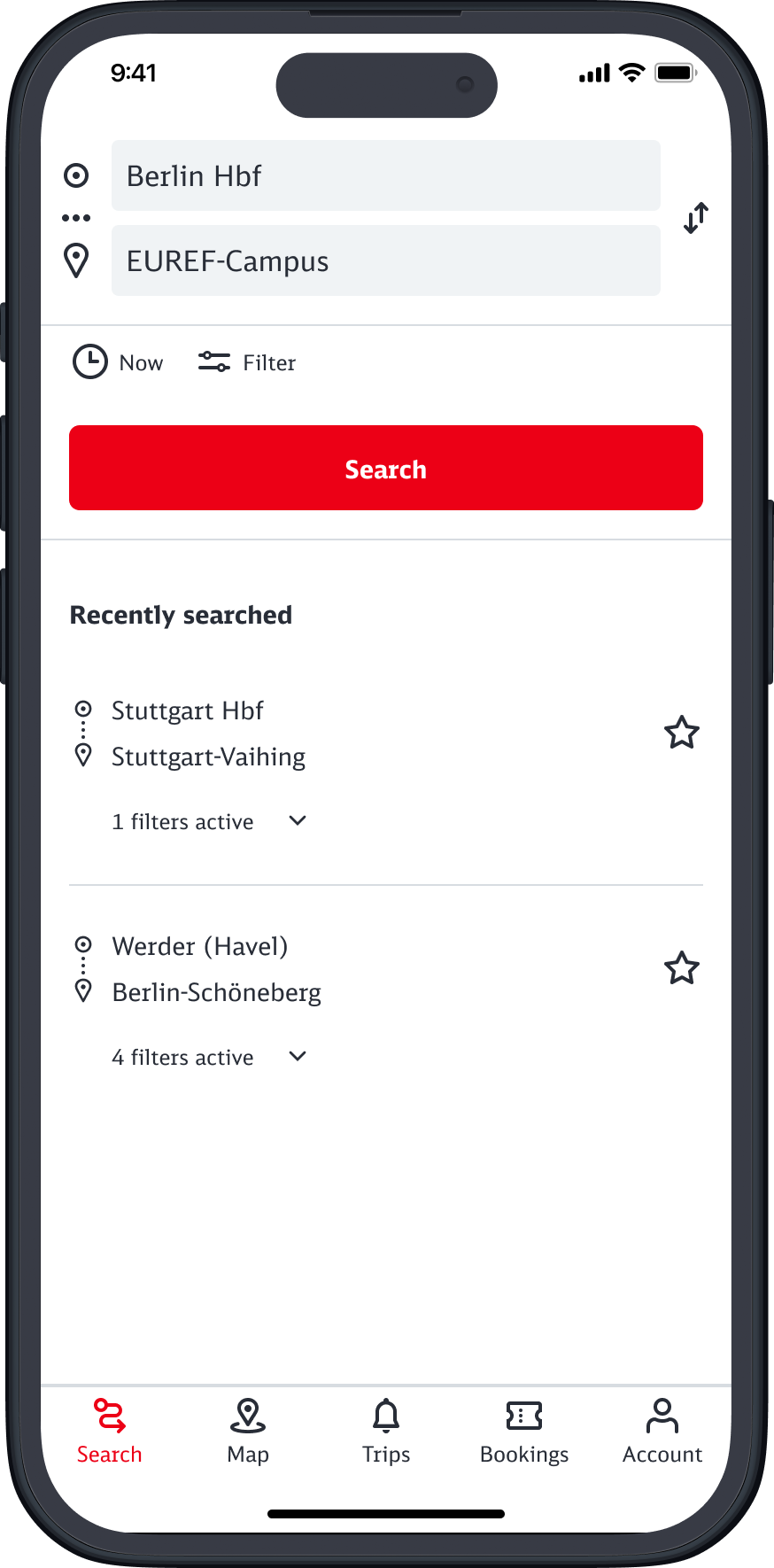
Start screen with a list of recently searched routes.
“Trips" tab with user's route subscriptions.
Bringing the informative details up-front — clear and concise
The solution
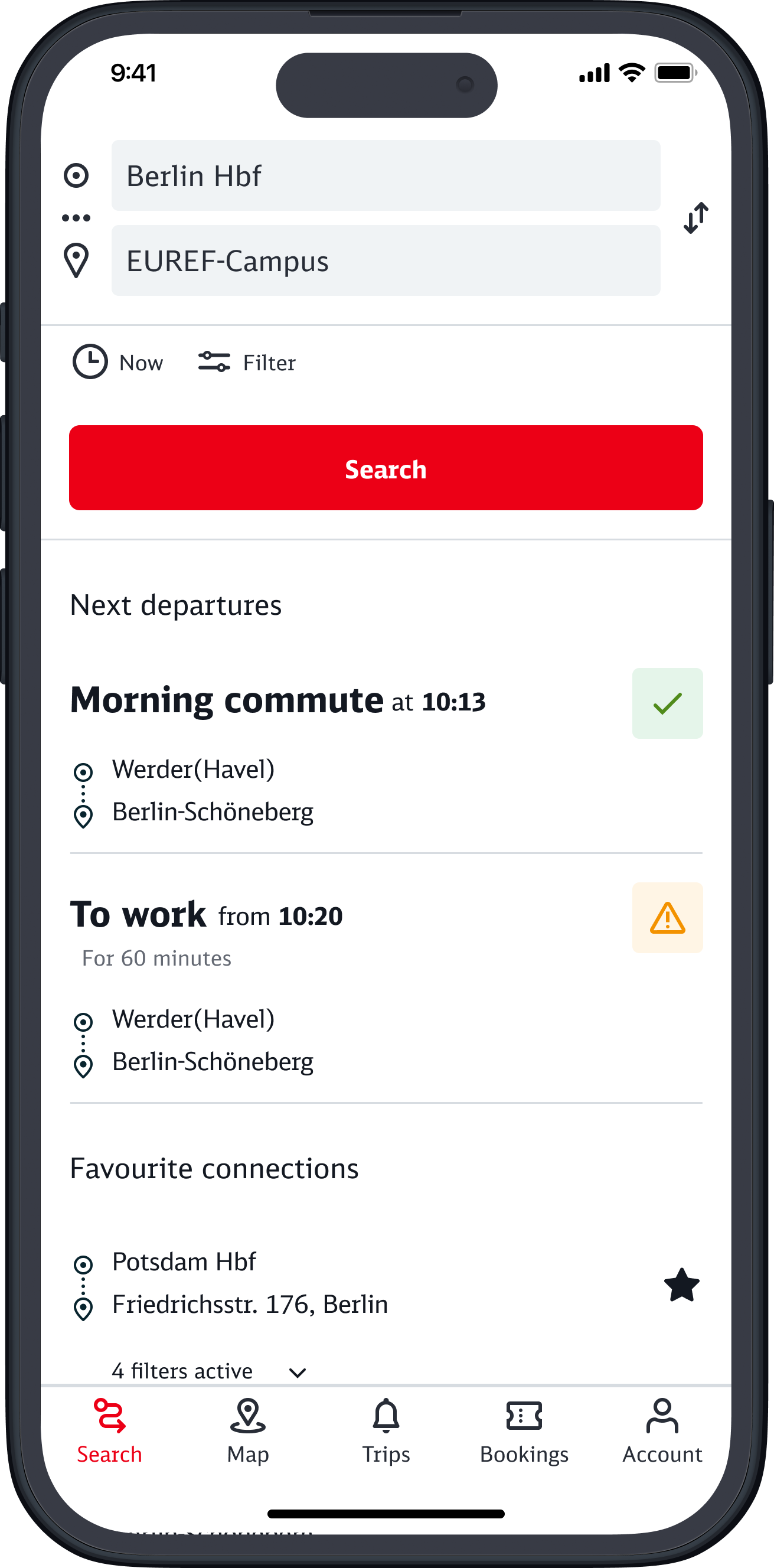
By bringing the information up front on the home / start screen, we assume that the users can proactively check the status of their upcoming commute (next departures) and have more details about their trips. The team and I agreed that this is an MVP solution for the current situation. We envisioned that the whole feature will need a hybrid segment solution to subscribe to their routes later on.
The teamwork with engineers to understand the underlying logic
The process
Creating a successful product requires a unified team effort, following a clear and organised plan. Through open communication, we embarked on an energetic journey that brought together our combined creativity, research, and technical skills.
DEP (Design-Engineering-Product) session on design iteration of the "Up-next" alarm feature.
Design and visuals
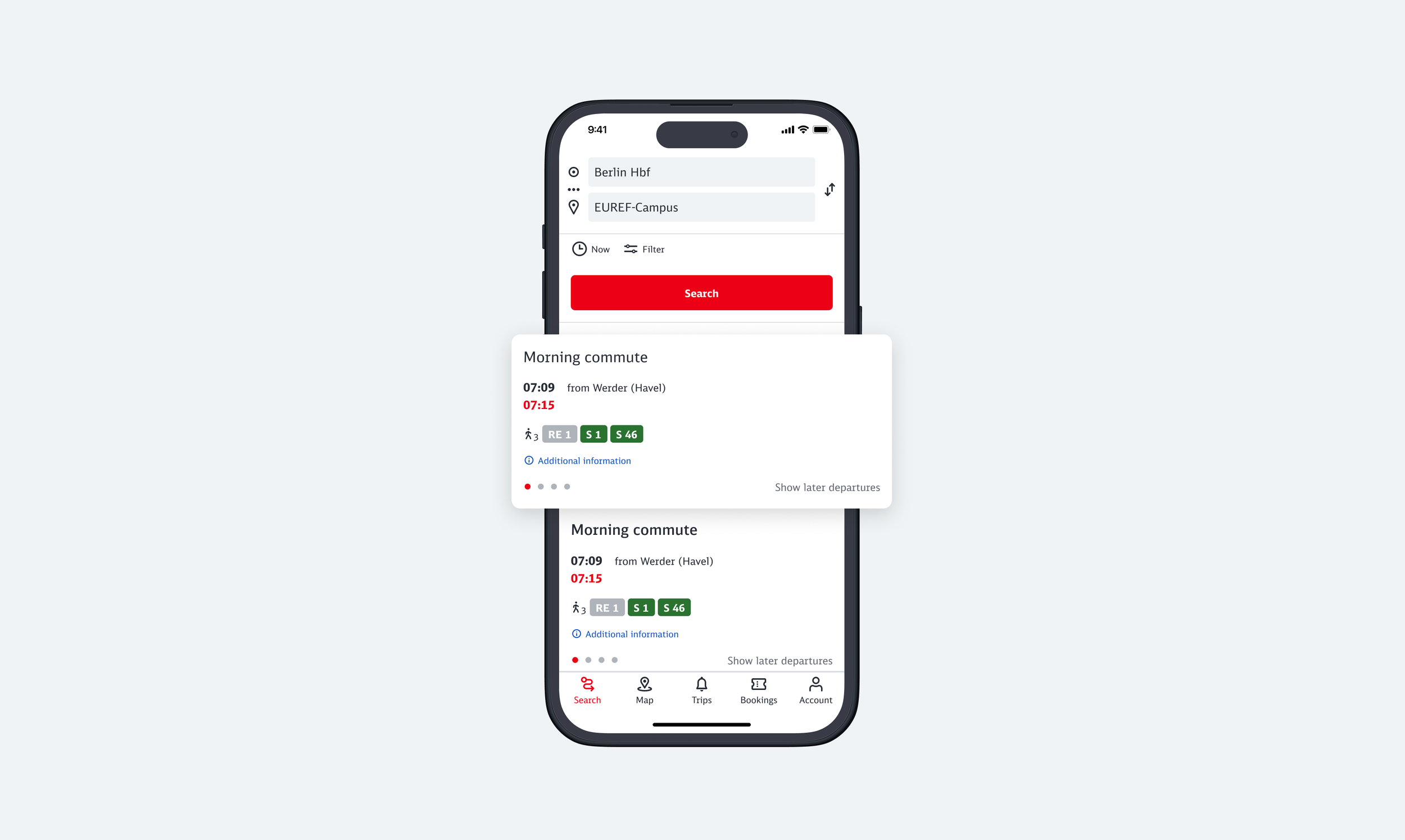
First iteration of the Up-next feature on the start screen.
Clear overview
Would like to see not only the next departure but the next three
Well done, keep it up
What did the users say
The beta test result
More information about the reason for delay
Show the delay time on the start screen
Font is too big
Deliverables
The iteration
Visual after the beta test: with pagination, users can swipe to check their commutes.
Thoughts and learnings
User-centered design
Developing the "up-next" alarm feature reinforced the importance of user-centered design. Understanding Germany's diverse commuting experiences was crucial. Simplifying the alarm types and bringing key information to the forefront improved user satisfaction and reduced operational costs and frustration by minimising excessive notifications.
Teamwork and collaboration
Close collaboration with a cross-functional team showcased the value of teamwork and open communication. This approach helped integrate technical expertise and user feedback effectively. Beta testing revealed user needs for detailed delay information and multiple upcoming departures, guiding further design iterations.
Continuous improvement
This project showed that continuous user feedback and collaborative development are essential for effective solutions. It emphasised the need for transparency, simplicity, and proactive communication in enhancing user experience.
Team
Arman FatheJalali— Product Owner
Moayad Albarbary — Senior Android Engineer
Morteza Kheyrifam — Senior iOS Engineer


